
My local support organisation Enabled Living, in the London borough of Newham, are currently running an awareness campaign on Twitter, encouraging people and organisations to add descriptions to their images online. I was invited to give some feedback on the design of the campaign and film some videos to support it, for which I was compensated for my time and effort.
So I want to link to the videos here, as I explain why social media is so important to me, and why image descriptions are vital. It’s always worth reminding people about, as just a short and simple description for an image will often make a big difference, and can determine whether or not we follow and interact with you.
Contents
- The Benefits of Social Media
- Inaccessibile Images
- Alt Text Tips
- Alt Text Examples
- Conclusion & Other Resources
The Benefits of Social Media
At its best, social media is a wonderful community space for connecting with friends and organisations, accessing important information, promoting products and services, and sharing fun content. I use it every day for one reason or another, reading and interacting with posts that I find to be accessible.
For example, in recent years social media has been vital to me for several reasons, such as:
- Making new connections with friends and organisations when I moved to London.
- Learning more about the city and other places I want to visit, so I can find things to do, keep an eye on travel updates, and so on.
- Preventing me feeling isolated during the Covid lockdowns, because I could stay in touch with friends all over the world, and access important information that helped me to make some sense of the situation.
- Supporting me since my recent redundancy, as I’m already being made aware of useful contacts and opportunities by the connections I’ve made.
- Sharing my blog posts and videos, which have led to all sorts of surprising opportunities from people and organisations who have checked them out.
Inaccessible Images
However, that’s all well and good, but I’m limited to the content I can access, because a lot of individuals and organisations post images that I can’t read or easily interpret, and they don’t add descriptions to them. So I can’t access the information, messages or humour they’re trying to convey. For example:
- If there’s text in an image, it may be too small, or lengthy, or poorly contrasted, or in a funny font, or over the top of a picture, and so on.
- If there’s no text in an image, it can still be very hard to interpret if it’s low resolution (so it pixellates when I enlarge it), or if it’s complex or abstract (like an unusual artwork or object).
- For people who use screen readers to have content spoken to them, the software will just say “Image” whenever it encounters a picture with no associated description, which is meaningless.
If you don’t describe your images, therefore, you’re excluding visually impaired people, even if that’s not your intention. That prevents us from following you, interacting with your posts, sharing your content, and spending money on any products & services you’re promoting.
That in turn means we’ll focus on other accounts and organisations, who do consider and welcome us by adding descriptions, so we’ll give them the benefits of our social interactions and financial transactions instead.
We also tend to spread the word amongst our community about the accounts that are most and least accessible, to help our peers find the information they need, and alert them to things they might want to buy.
Alt Text Tips
Writing Alt Text is much quicker and easier than many people think. There seems to be a common misconception that it needs to be really detailed, describing every single aspect of the image. But that’s often unnecessary. For instance:
- You don’t need to describe what people are wearing, unless it’s an outfit you particularly want people to focus on and know about for some reason.
- You don’t need to describe every object in a room. Just the general purpose or style of the room is fine, with one or two notable objects mentioned if you wish.
- You don’t need to start with “image of”, because screen readers will announce that it’s an image before they read your description anyway.
So don’t overthink it. Just be specific and concise, so we get a basic sense of what the image is, and the most important aspects of it. And if the image is meant to be funny, reflect the humour in the description so we all get the joke.
If you’re not sure how to add Alt Text, the method of differs on each platform, but it’s simple when you know how. For instance:
- Twitter has instructions along with some top tips, while there are also instructions for Instagram and Facebook.
- If you’re blogging, an Alt Text box should be one of the fields provided when you upload or edit an image.
- If you’re writing HTML code for a website, then you can include the “alt” attribute within the “img” tag.
Alt Text Examples
Here are a few images from my recent September 2022 Favourites post, with a copy of the Alt Text in each case, so the description is visible to everyone for a change.
Bear in mind that these are just examples of my own personal style, which I’ve got into the habit of doing over the past few years. Other people will describe these images in their own way, perhaps more concisely. And given my own dodgy eyesight there may even be aspects I’ve got slightly wrong.
So this is just to give you a sense of what’s possible, and how descriptions can vary in length and detail depending on the context.
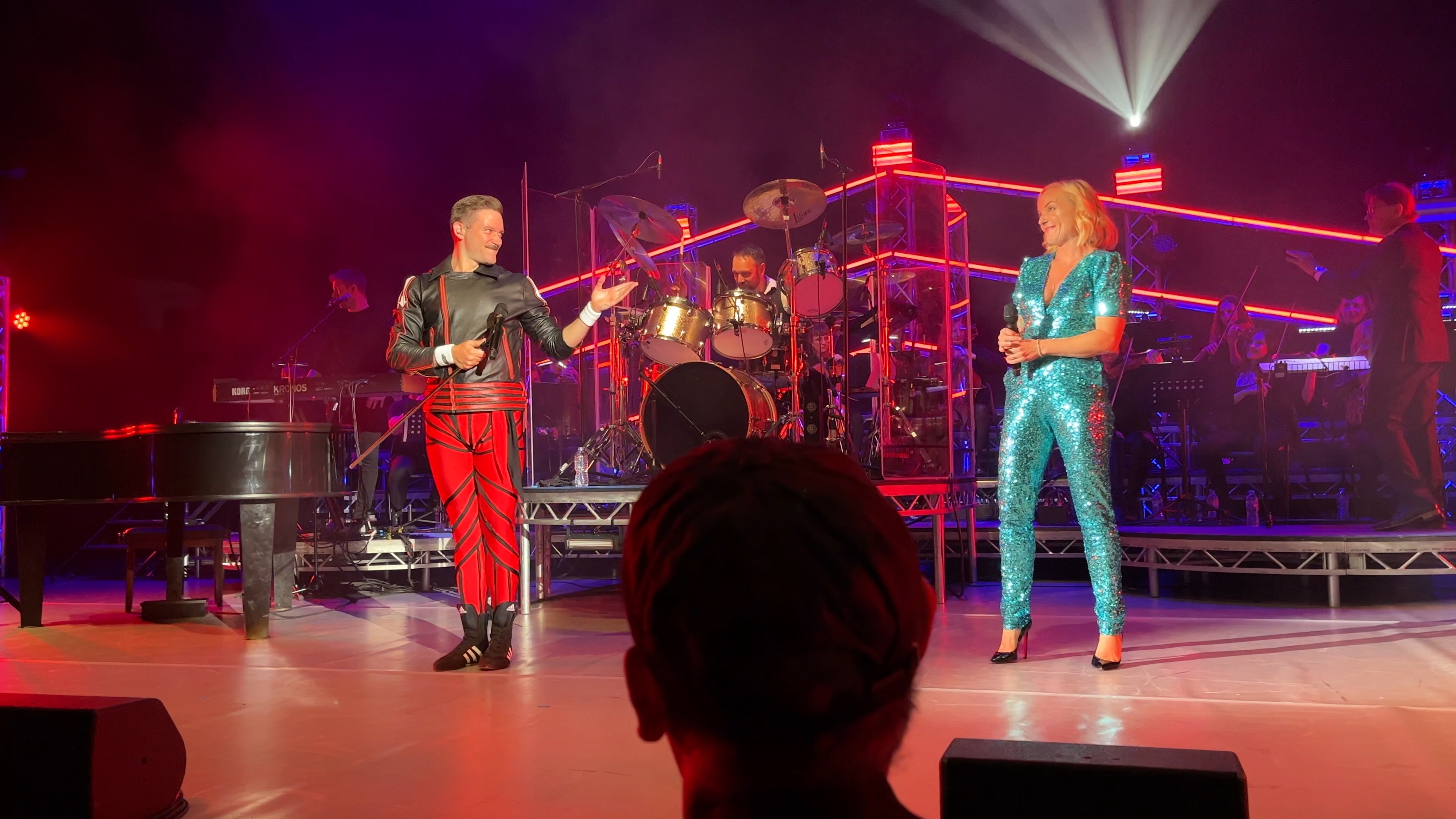
Alt Text: “Queen Machine in concert at the Hammersmith Apollo. The lead singer looks a bit like Freddie Mercury, with his moustache and body-hugging outfit of black jacket and red trousers. He’s smiling and gesturing towards West End star Kerry Ellis, a smiling blonde lady wearing a very sparkly, short-sleeved, low-cut, light blue bodysuit, along with black high heels. Behind them, to the right of the drummer on his large kit, the London Symphonic Rock Orchestra are playing on stringed instruments.”
That Alt Text is fairly long, and I could have just written: “Tribute band Queen Machine on stage with singer Kerry Ellis and a backing orchestra.” That would still have conveyed the essential message of the image perfectly adequately. I just tried to make it a bit more interesting, to give a sense of what the concert was like. But I’ve still simplified aspects of it, such as the male singer’s outfit, which would have been difficult to describe in fine detail.
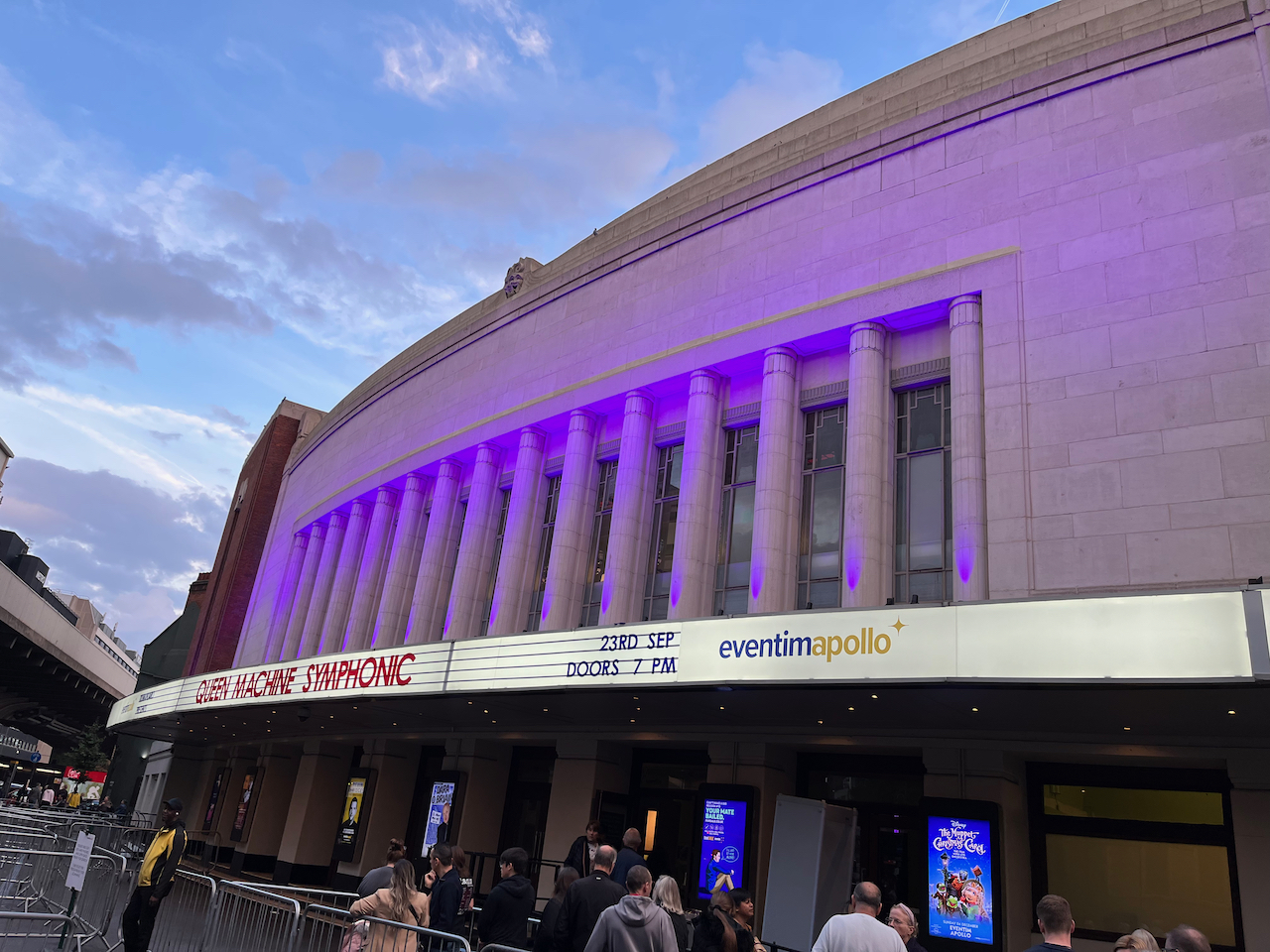
Alt Text: “The Eventim Apollo building in Hammersmith, with writing on the long white lit-up curving canopy over the entrance doors that reads Queen Machine Symphonic, 23rd September, doors 7pm.”
Notice I haven’t attempted to describe the architectural design of the building here. That’s partly because I can’t think how best to do so, but it’s also not critical information given the purpose of the photo. So I’ve simply stated what the building is, and explained how the title of the show is displayed. But it would also have been sufficient if I’d just said: “The outside of the Hammersmith Apollo with people queuing to see Queen Machine Symphonic.”
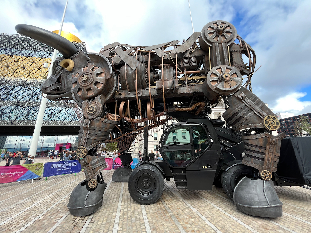
Alt Text: “Left side view of the very large animatronic bull from the Commonwealth Games, made up of lots of different metal parts including wheels and chains. A cabin with big wheels sits beneath the bull’s chest, which can be used to drive it around.”
This is an attempt to simplify a very complex structure, as it would have been rather hard to describe the bull in depth. So I just wanted to put the most prominent elements across to give a general sense of what it’s like.
And apart from me, it’s also worth noting that Twitter allows you to see the image descriptions that users have written, by clicking the world ALT if it appears in the bottom left corner of an image. That’s a great way to see what other people are doing. Accounts that use the feature really well include disability organisations like the RNIB, Scope & Enabled Living of course, along with famous users like comedian Sarah Millican, cartoonist Moose Allain, the National Theatre & space agency NASA (who got a lot of great reactions to an image captured by their Webb Telescope). So do go and check those out. And next time you scroll through your Twitter feed, see how many people you follow are using the feature too, and perhaps give a friendly nudge to those who aren’t.
Conclusion & Other Resources
I hope that’s all been useful, and has inspired you to try describing your own images if you don’t already. Just don’t be afraid to give it a go.
It’s a little addition to your posts that really makes a big difference to the visually impaired community, so it’s important to do it if you value our attention and interactions. We’ll feel much more inclined to follow you, respond to your posts and share them if we can understand the images you share.
And if you’re selling products and services, we’re much more likely to consider spending money with you and spreading the word to our friends, if you make your images accessible. Otherwise we have to target our finances to those who are inclusive.
So using Alt Text benefits everyone, ultimately, and thank you for taking the time to read about it. If you want to dig a bit deeper and find out more, I highly recommend checking out:
- Enabled Living’s tweets about Alt Text and their support services in Newham.
- The advice by Marcomedia, the creative design team supporting the campaign.
- The Big Business of Digital Accessibility, an article I wrote in 2019 which is still very relevant today, and includes appearances I made on TV and radio.
- Scope’s articles about writing better descriptions & common mistakes to avoid, plus their Twitter thread of tips.
- Other blog posts about Alt Text by Blind Girl Adventures and Life Of A Blind Girl.


2 thoughts on “The Importance Of Image Descriptions (Alt Text)”